In the early days we promoted agile project management only for small teams because that was where it originated. We had plenty of experience to say that agile worked well on seven- to 10-person teams. We were also quick to learn the techniques that allowed agile project management methodologies to scale up to around 20 to 40 people. These days, though, there are many truly large projects being done with agile methodologies.
In preparing for this posting I started counting on my fingers the number of 100+ person projects I'm aware of. I quickly ran out of fingers. I've been involved in a couple of 500+ person projects and am aware of three projects that each have over 1,000 people. We are truly at the point of doing large scale agile. Unfortunately, the charts and tools we use for such large projects have not entirely caught up with us.
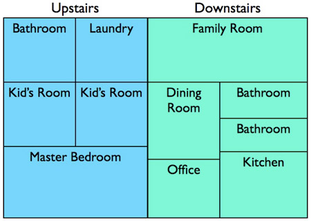
For example, the time-tested Scrum burndown chart is absolutely wonderful but is really limited to showing only one thing: a single team's rate of progress through their product backlog. This month I want to write about visualizing large product backlogs using a technique I've been advocating with my clients for three years but will be writing about here for the first time. Suppose you have a very large product backlog--such as one with lots of themes (groups of related user stories) or being worked on by multiple agile teams. The best way to visualize this product backlog is with a treemap. Treemaps were invented in the 1990s by Dr. Ben Shneiderman as a way of visualizing hierarchical (that is, tree-structured) data. The following is a simple treemap of a two-story house:
In this treemap, each rectangle is sized to represent the relative area of the room. From it you can see that the master bedroom is about twice the size of either kid's room and a little larger than the downstairs family room. The combined green area of the downstairs rooms is slightly larger than the area of blue upstairs rooms. From this very simple treemap you can get a feel of certain aspects of this house. To visualize a product backlog with a treemap we need to conceptualize it as hierarchical data. We can do this a couple of different ways. For example, Rental Car Theme
- As a traveler, I can rent a car
- As a traveler, I can get collision insurance on a car rental policy.
- As a traveler, I can request a baby car seat be inside my car.
Airplane Theme
- As a traveler, I can request an aisle seat.
- As a frequent flyer, I can request an upgrade to first class.
Or we could create a product backlog as a tree with levels for
- Team
- Product Backlog Items Being Worked On By That Team
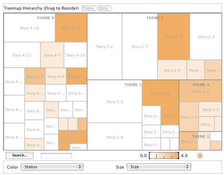
The following figure shows a product backlog as a treemap. There are five themes in the treemap. (Theme 4 is in the top left; Theme 1 is in the bottom right. You can click on it to enlarge it but be sure t come back.) Each theme is made up of a number of individual user stories. Story 4-28 (indicating the 28th story of theme 4) is in the top left. I've used this "theme-dash-story" notation for simplicity only for this example. I wouldn't do that on a real project, of course.
The size of each story in the preceding figure represents the number of story points that the story was assigned when estimated. Colors can be used on a treemap to represent an additional attribute of the data. On agile projects I've used colors to represent whether a user story has been developed or not. One color coding we used was:
- Done
- Started but not done
- Not started but not planned to have been started yet
- Not started but it should have been started by now
- Blocked
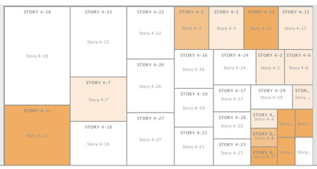
I've also used color to indicate which team would work on a user story / product backlog item or whether the item was ready for development or not. Treemaps are very flexible in this regard. Check out the link to the stock market as a treemap at the end to see a great example of using color. A good treemap is interactive--you can mouse over, click on regions of it, and so on. For example, in the treemap above you'll notice that some of the user stories of Theme 4 are so small you can't read them. Clicking on a part of Theme 4 should zoom the treemap in so it displays only Theme 4, meaning more room is available and more detail can be shown as below:
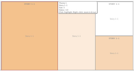
Sometimes zooming isn't enough. A good treemap implementation will also display additional detail when mousing over part of it as shown in this example:
Treemaps are an excellent way of visualizing large product backlogs. To date, I've made use of various open source or relatively inexpensive general treemapping tools to create these on my projects or for my clients. Hopefully now some of the leading agile tool vendors begin to incorporate this type of visualization technique into their products. I would love to be able to visualize a large product backlog and interact with directly from within some of those tools. Until then, check out some of the links below for useful ways to create treemaps. The ones in this posting were created with IBM's free Many Eyes tool.


